Android Auto’s new Google Assistant UI is giving off major Siri vibes


Adam Birney / Android Authority
TL;DR
- Google’s latest Android Auto update introduces a new visual interface for Google Assistant during voice interactions.
- The new UI features a colorful, animated wave that bears a striking resemblance to Apple’s Siri interface on CarPlay.
Google has recently given the Google Assistant experience in Android Auto a facelift. The new look, which pops up during voice chats with the Assistant, is drawing comparisons to Apple’s Siri on CarPlay. We’ll let you decide if that’s indeed the case.
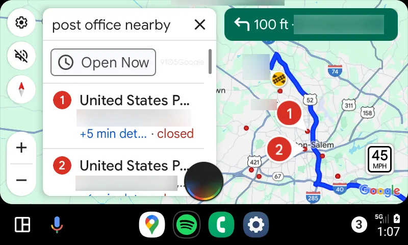
First spotted by 9to5Google, Google Assistant on Android Auto seems to be getting a new circular hovering UI with a dynamic, colorful wave that animates in response to voice activity, occupying the lower portion of the screen. Notably, this new interface doesn’t replace the Google Assistant bar at the bottom of the screen, which is still your go-to for starting commands. Instead, this new design takes center stage when the Assistant is waiting for your response — like when it needs you to pick which coffee shop you actually want directions to.

However, this design choice bears a close resemblance to Siri’s visual representation on CarPlay. Siri on CarPlay also features a colorful, animated circular wave UI that appears during voice interactions and is positioned in the lower part of the screen. Google’s version, naturally, uses its distinctive color palette.
While some might wonder if a new UI is really necessary when Google Assistant is already occupying the bottom bar, it definitely adds a bit of visual flair to the Android Auto experience. But let’s be honest, the resemblance to Siri’s interface is hard to miss, and it’s certainly got people talking.
It’s not clear yet how widely this new look has been rolled out or if it’s here to stay as the default for Google Assistant on Android Auto. It’s worth noting that Google is gradually transitioning to Gemini as its default assistant on mobile devices, though Android Auto has yet to experience this shift.

